I can’t tell you how often a person will come in with a little something to frame and say, “I just want a simple black frame. I don’t want the framing to overwhelm the art”. Sometimes, a simple black frame is just right for the artwork, but we like to give our customers options to show them that more elaborate framing won’t necessarily overwhelm their artwork but can bring out the beauty of the art in very subtle ways.
In the custom framing world, our goal is never to overwhelm or outshine the art. Instead, we want to work to create a space where the art can shine.

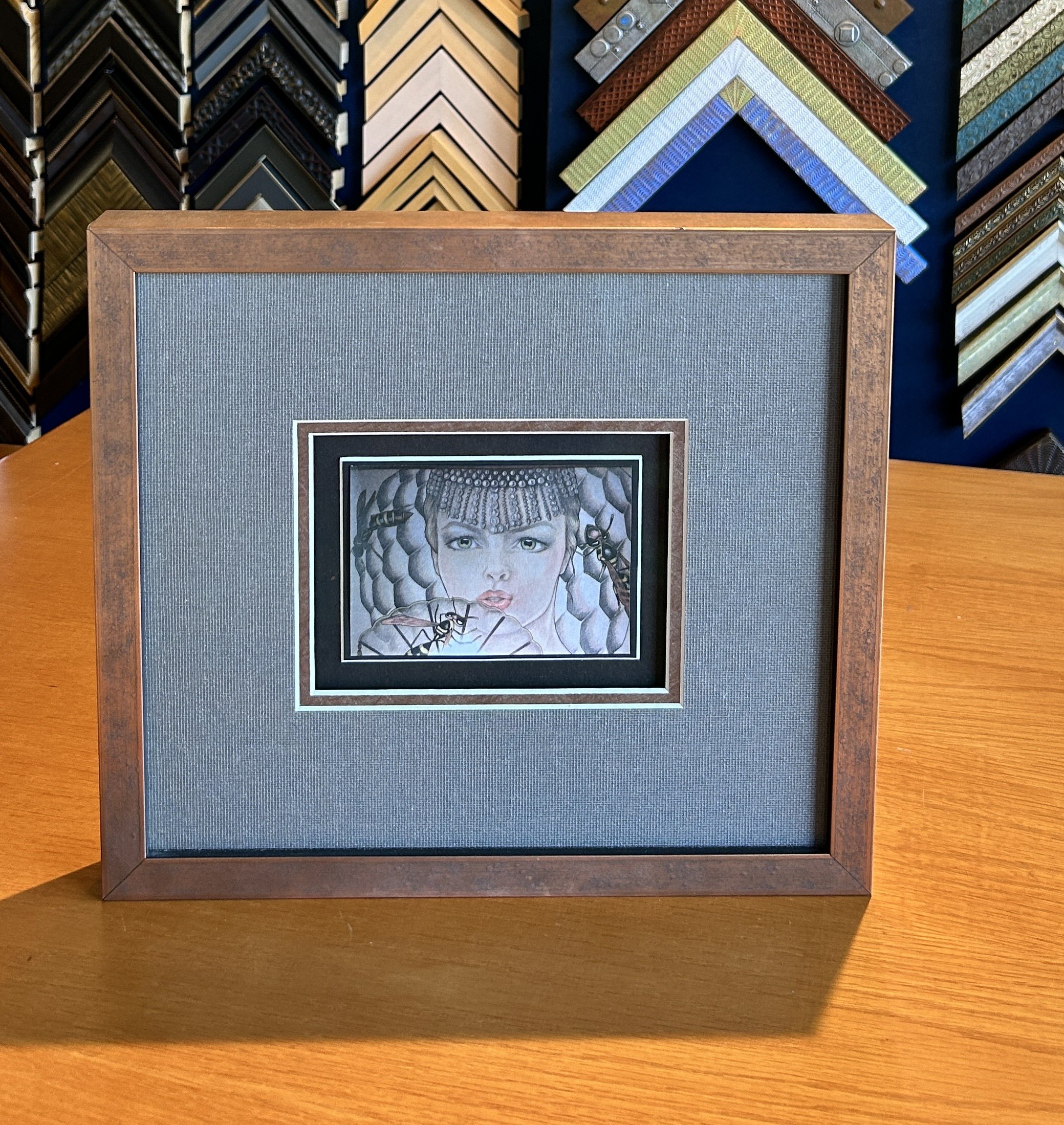
Maybe it’s just a card or a little drawing with no monetary value, but the sentimental value is huge. This is a photocopy of a very small section of a large painting by Antonia Tyz Peeples. I had always admired the painting that Antonia painted and sold years ago. Antonia remembered how enamored I was with the painting and when she came across this little 4.75” x 3.25” simple paper copy of the section in 2011, she sent it to me with her best wishes for a peaceful year.
.
A classic black frame with a white mat would have looked great on this piece, but we like to give our customers options they may have never considered; that’s what is so cool about custom picture framing.

Black and white option
Textured mats, subtle sparkle, and color also work great. And in the end, if the more traditional option is chosen, our customers know they have chosen the best option for them and their vision of the art.

Color and textures in matting and framing.
What is the first thing you notice when you look at this artwork? It’s the girl. Your eye is immediately drawn to what is most important: the subject. Then, you begin to notice the matting and framing and appreciate the details and how the various components work together to complement the art and draw your eye in.
Let's consider the process of custom framing a small piece like this. The paper was cut unevenly, so Evan mounted the image onto a black mat to visually minimize the uneven edges. A white beveled edge created a nice crisp look when this component was top-mounted onto another black mat and surrounded by two more mats. The gray mat is a fabric mat with sparkle, and the copper-colored accent mat has texture and some shine. Evan used a spacer to elevate the top two mats about 1/4” above the art, creating a sense of depth and drama.
Notice how the copper frame and the mats harmonize with the art, drawing your eye directly to the most important element: the art itself.

Showing the sparkle of the mats and the shadow created elevating the two outer mats up over the art.
This is relatively elaborate framing with 3” of matting and multiple mats, yet rather than overwhelm the art, it works together with the art for a lovely presentation.
Many times, it’s the details that make all the difference, and when you work with a custom framer, you have the advantage of our skills, access to materials, and years of experience.
Finished faming